Analytics

We360.ai analytics — timeline, activity, and productivity tracking with workforce analytics and goal monitoring.

The Analytics hub within the Productivity Suite is where raw tracking data is categorized according to your organizational rules to generate powerful insights.

Timeline

The Timeline acts as the chronological diary of an employee's workday.

Timeline Functionality
  • Daily Representation: It visually represents continuous blocks of work over a 24-hour horizontal axis.

  • Dual View Modes: The Timeline can be toggled via a primary switch between two modes:

    • Activity Mode: The timeline blocks are colored based purely on input volume (e.g., Active vs. Idle).

    • Productivity Mode: The timeline blocks are colored based on the assigned categorization of the software used (e.g., Productive, Unproductive, Neutral).

  • Punch Flags: Clear visual indicators (colored arrows) show the exact moment of the first "Punch In" and last "Punch Out" of the day.

  • Employee Drawer: Clicking on any user's timeline opens a detailed side-drawer (EmployeeTimelineDrawer) that provides an hour-by-hour breakdown of their precise activities, applications accessed, and power logs.
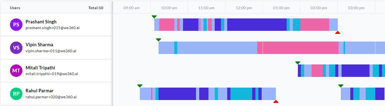
Timeline overview with color-coded bars
Timeline overview showing employees' workdays as color-coded activity blocks.
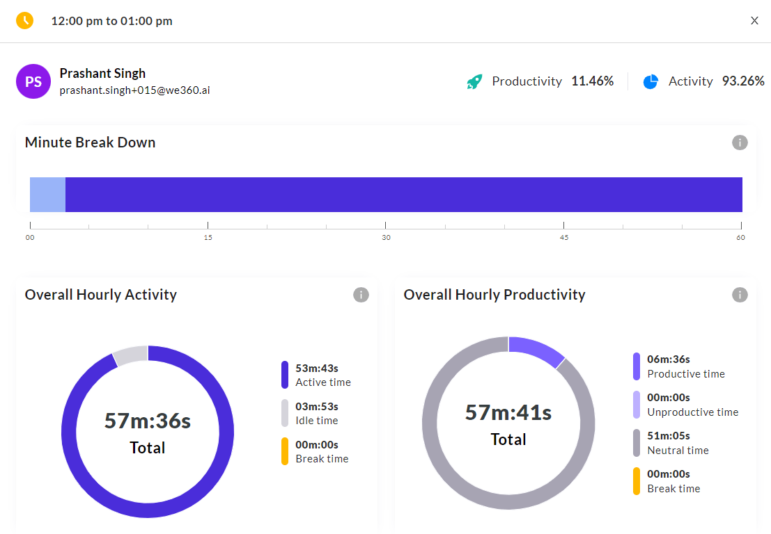
  • Hourly Detail View: Clicking on any 1-hour interval within the timeline opens a detail view showing productivity and activity percentages along with a minute-by-minute breakdown. The granularity of the breakdown interval varies from 5 to 30 minutes depending on the screenshot frequency setting configured in Settings. Enterprise-tier customers can configure a higher screenshot frequency.

  • Screenshots: If enabled, the hour-interval timeline is sub-divided into sections based on the screenshot frequency. For example, if the frequency is set to once every 5 minutes, the hour is divided into 12 sections. Clicking on each section opens the screenshot for that interval along with additional details:

    • Activity Detail: Shows the duration of the interval, the number of key presses and mouse clicks recorded.

    • Application Logs: Lists the applications accessed during the interval.

    • Admins can flag or download individual screenshots as needed.

    • If screenshot permission is disabled for a user, clicking on a section reveals only the Application Logs and Activity Detail without a screenshot image.

Timeline hourly detail view
Timeline detail view showing hourly activity and productivity breakdowns.

Timeline 1-hour interval interaction
Clicking a 1-hour interval reveals the minute-by-minute breakdown.
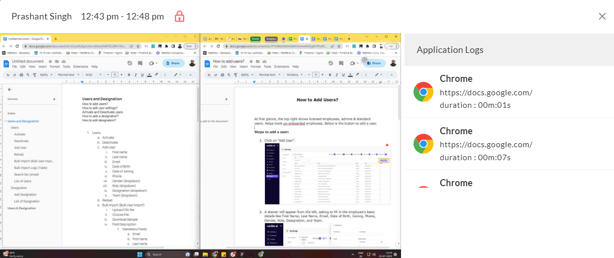
Timeline screenshot detail
Screenshot detail view with application logs and activity metrics.
Timeline view
Timeline view showing an employee's workday as color-coded activity blocks.

Screenshots

The Screenshots feature automatically captures screenshots of employees' systems at predefined intervals exclusively during their punched-in hours. Once an employee punches out, screenshots are no longer captured.

Screenshots Functionality
  • Capture Frequency: The snapshot frequency is adjustable, ranging from 5 minutes to 2 hours. At the minimum interval of 5 minutes, up to 12 snapshots per hour are captured. Screenshot capturing can be disabled for individual employees based on organizational preferences.

  • Screenshot Details: Each captured screenshot includes a detailed analysis: the application or URL in use, key presses, mouse clicks, and the activity level for the preceding interval.

  • Three Tabs: The Screenshots feature is organized into three tabs:

    • All Screenshots: The primary screenshot dashboard displaying all captured screenshots.

    • Flagged: Displays screenshots that have been flagged by any manager or admin.

    • Flagged by Me: Shows only the screenshots flagged by the currently logged-in manager or admin.

  • Dashboard Layout: The interface is split into two sections. The left panel lists employees, allowing you to select a specific user. The right panel displays a grid of screenshot thumbnails for the selected date. Each thumbnail includes a timestamp, activity level indicator, flag button, and download button.

  • Screenshot Detail View: Clicking any screenshot opens a deeper view showing:

    • Applications and URLs used during the interval, along with their duration.

    • Activity metrics including key presses, mouse clicks, and activity percentage.

    • Zoom functionality for closer examination.

    • Options to download the screenshot or mark it with a flag for future reference.

  • Bulk Download: You can download all screenshots for a specific date in bulk, or download individual screenshots as needed.

Activity (Input Volume)

The Activity section moves away from what an employee is viewing, and focuses entirely on how they are interacting with the device.

Activity Metrics
  • Activity Formula: Activity % = (Active Time / Online Time) x 100. This metric quantifies how much of an employee's online time is spent with active device input.

  • Input Measurement: It measures Keystrokes per minute and Mouse clicks/scrolls to establish a baseline of physical engagement.

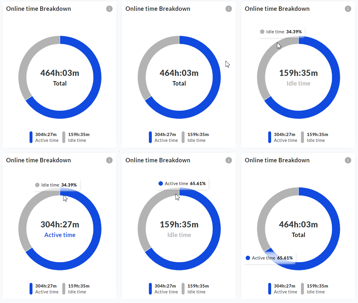
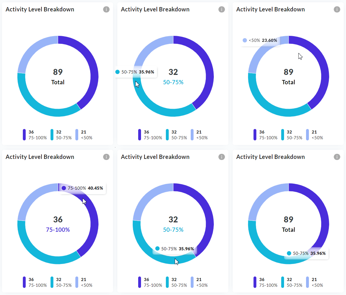
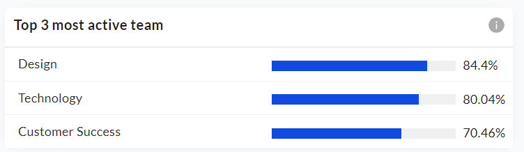
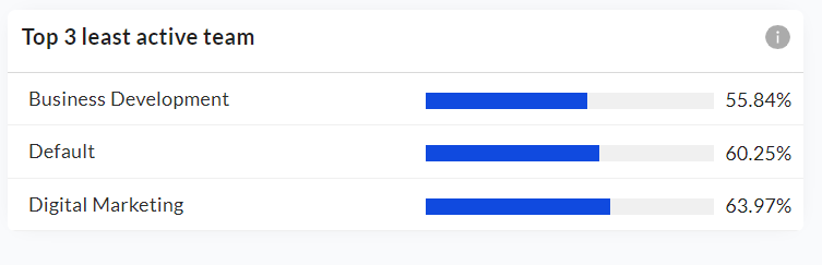
  • Summary View: After selecting the team and date range filters, the summary view displays metric cards including the overall activity percentage, the top application and URL used across the organization, and the top app/URL category. Two doughnut graphs are provided: an Online Time Breakdown (Active Time vs Idle Time) and an Activity Breakdown (grouping users into three brackets: <50% active, 51--75% active, and 76--100% active). The summary also lists the top 3 most active and top 3 least active teams or users, along with a teamwise activity breakdown bar graph. The summary view can be downloaded as a PDF.

Activity metric cards
Activity summary metric cards: Activity %, Top Application, Top URL, and Top Category.
Online Time Breakdown doughnut
Online Time Breakdown doughnut showing Active Time vs Idle Time.
Activity Level Breakdown doughnut
Activity Level Breakdown grouping users into activity brackets.
Top 3 most active teams
Top 3 most active teams ranked by activity percentage.
Top 3 least active teams
Top 3 least active teams for quick identification of low engagement.
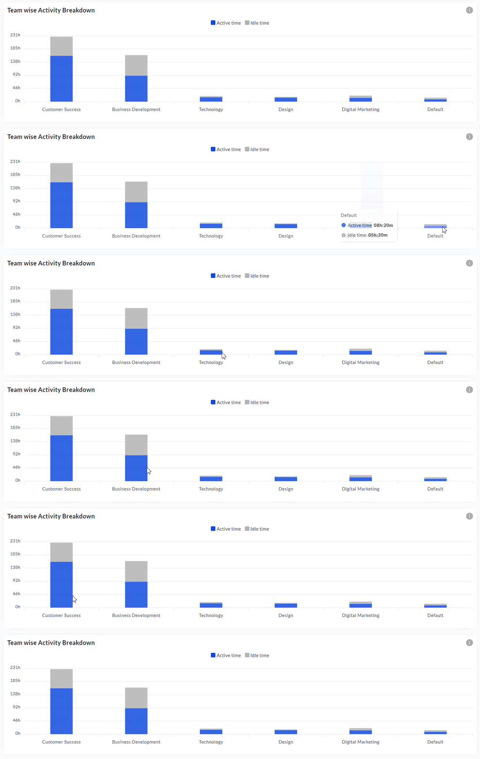
Teamwise activity breakdown
Teamwise Activity Breakdown comparing active vs idle time per team.
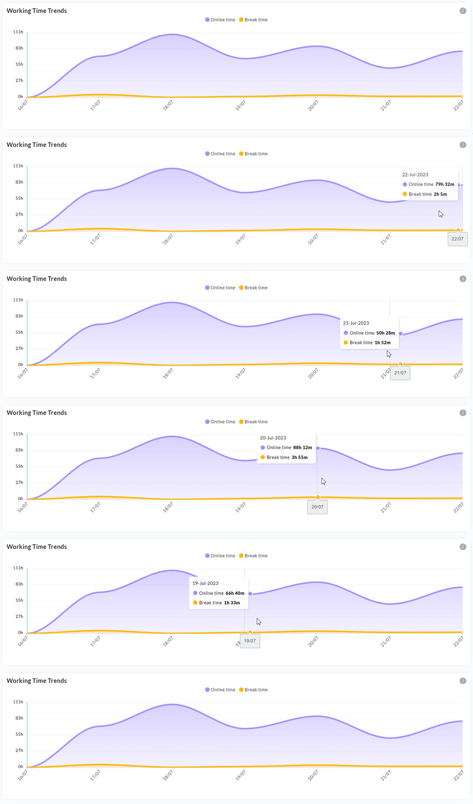
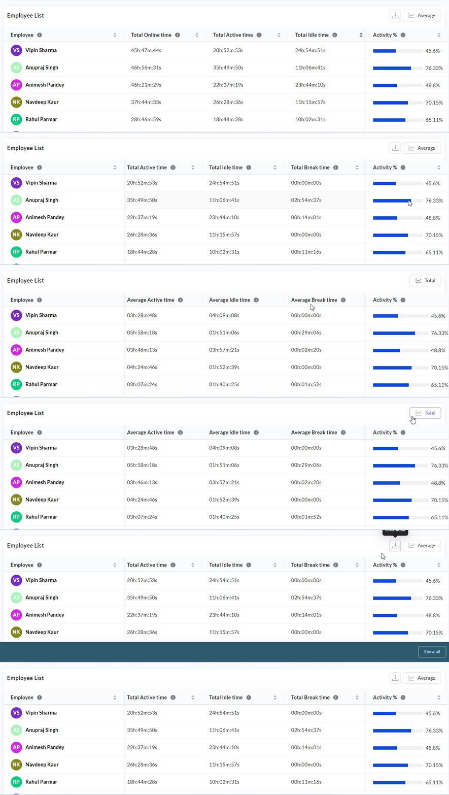
  • Detailed View: The detailed view includes team, user, and date range filters. It displays an Overall Working Time Trends graph showing Working Time, Online Time, Offline Time, and Break Time for the selected range. Below that is a Teamwise Activity Breakdown graph comparing Active Time and Idle Time per team. A detailed table lists all employees with their Working Time, Online Time, Offline Time, Active Time, Idle Time, Break Time, and Activity Percentage. You can toggle between total values and average values for the selected period. Both views are available for download as CSV.

Working Time Trends
Overall Working Time Trends graph in the detailed view.
Activity detail table
Detailed employee table with activity metrics and toggle for total/average values.
  • Team Outliers: Top and bottom team outliers are displayed with progress bars for quick visual comparison.

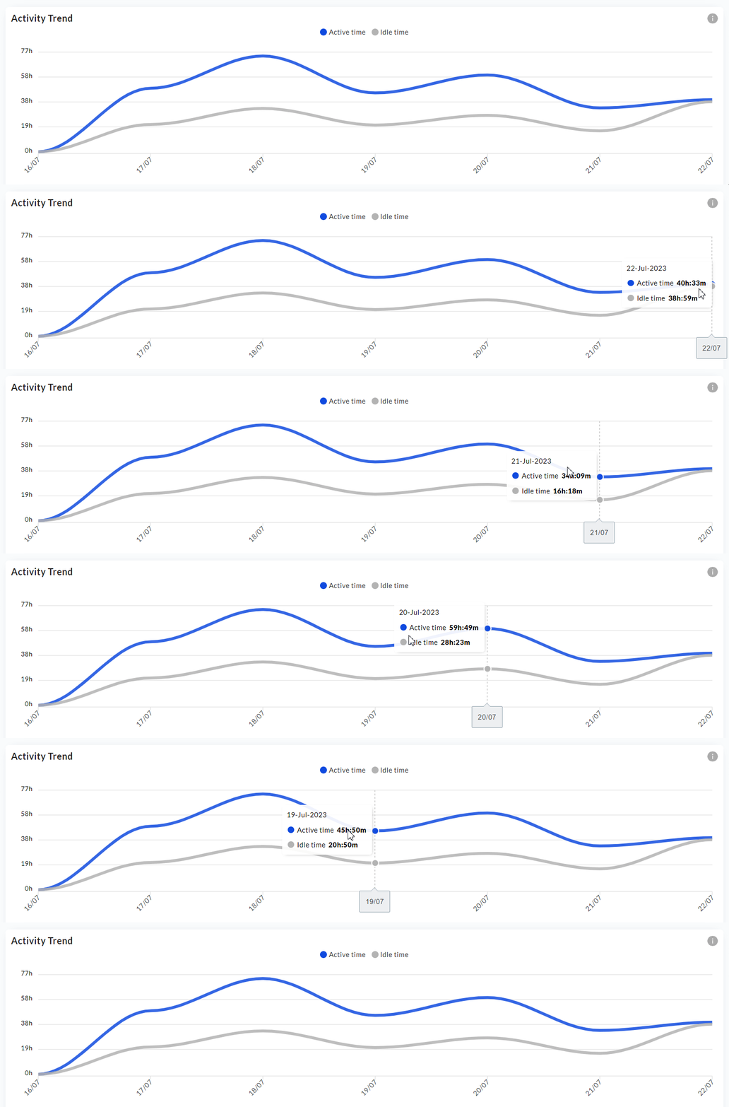
  • Trend Analysis: By filtering across a team, managers can spot individuals whose physical input volume has dropped significantly compared to their historical average, which may indicate blockers or disengagement.

Activity trend over time
Activity trend showing active vs idle time fluctuations over the selected period.

Productivity

The Productivity feature is the categorization engine. Based entirely on the rules configured in the Settings Center (where URLs and Apps are classified), this section provides a breakdown of time spent.

Productivity Categorization
  • Productivity Formula: Productivity % = (Productive Time / Online Time) x 100. Time is categorized as Productive, Unproductive, or Neutral based on the app/URL category mappings configured in Settings.

  • Productive Time: Time spent on pre-approved, role-relevant tools.

  • Unproductive Time: Time spent on categorized non-work-related sites (e.g., social media).

  • Neutral Time: Time spent in applications not yet classified.

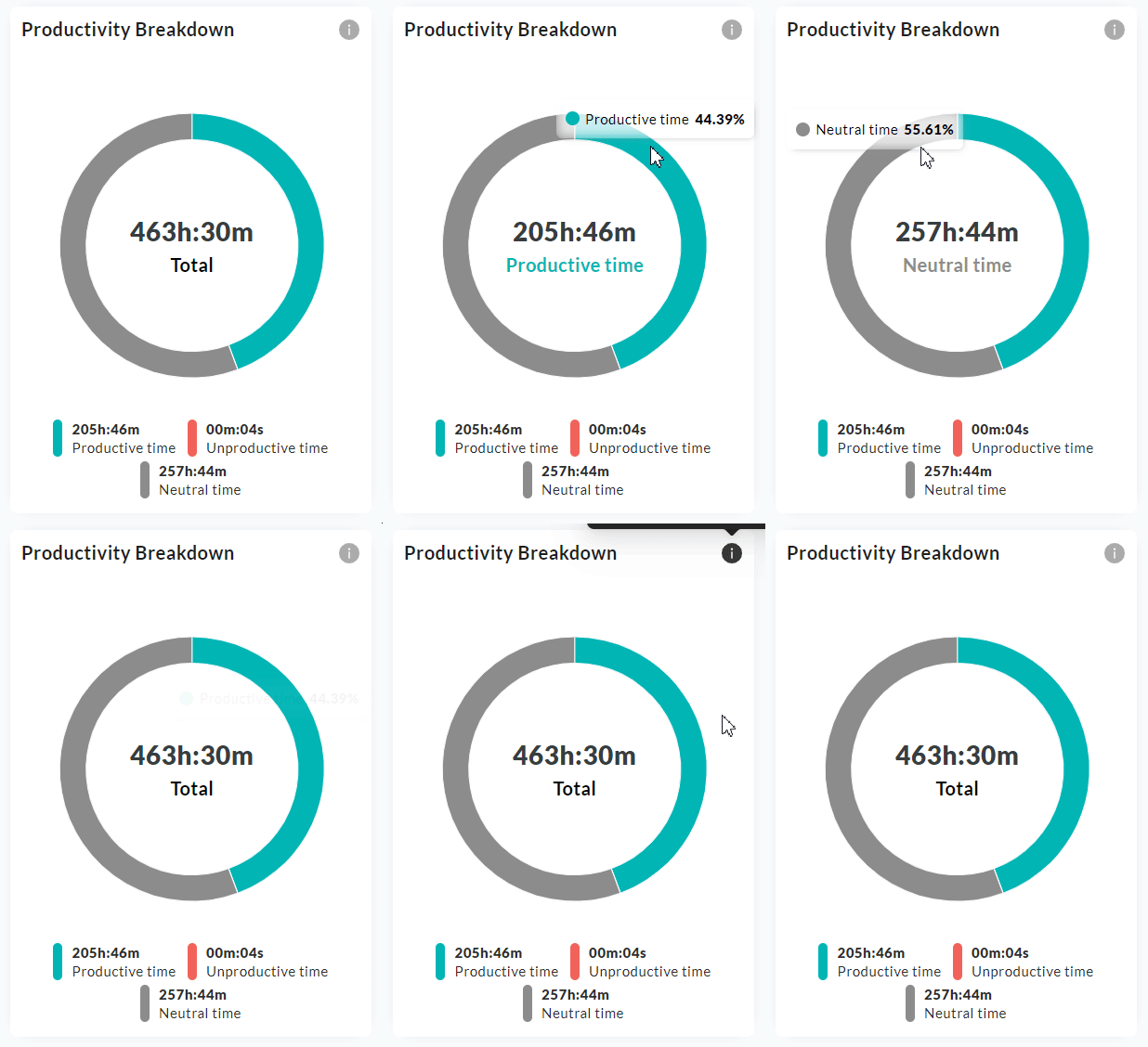
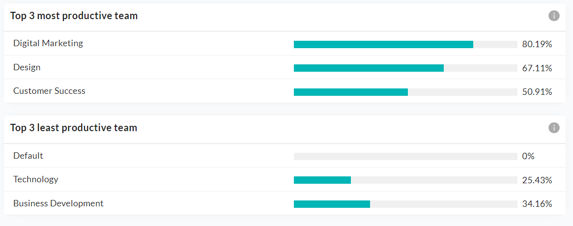
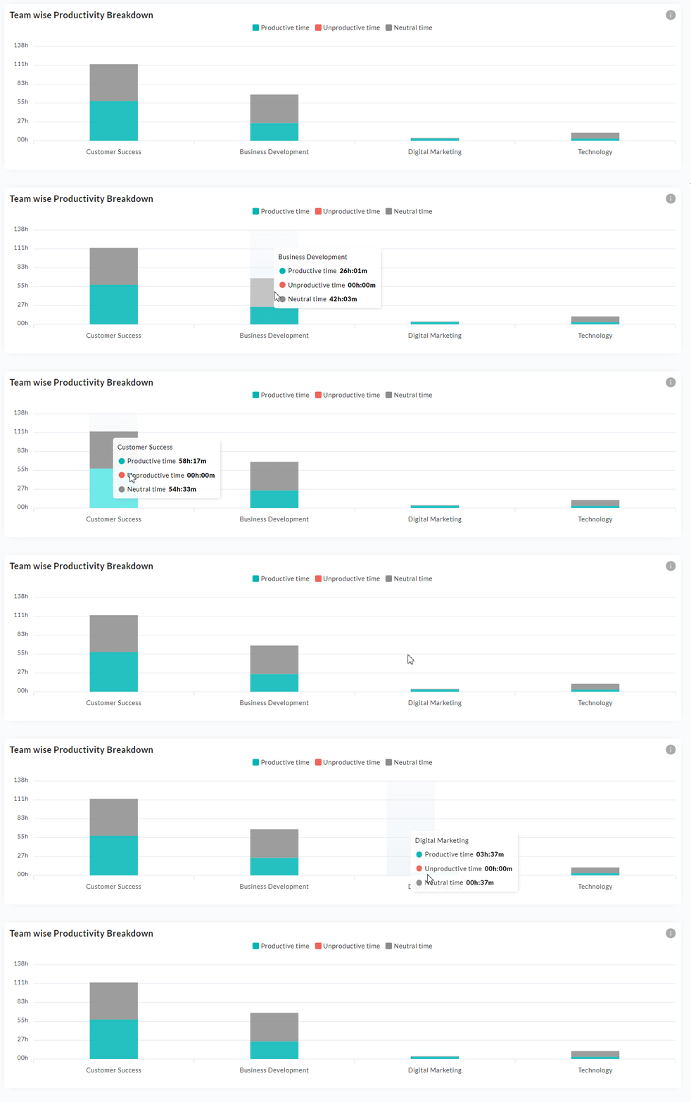
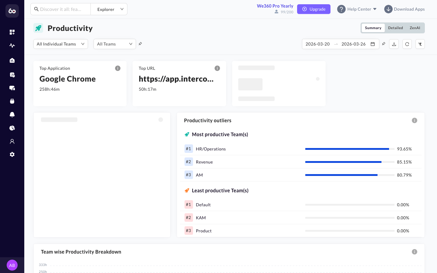
  • Summary View: The summary view provides four metric cards: overall Productivity percentage, the Top Application used, the Top URL visited, and the Top Category contributing to productive time -- all within the selected team(s) and date range. It includes a productivity breakdown pie chart (Productive / Unproductive / Neutral), lists the Most Productive Teams (top 3) and Least Productive Teams (bottom 3) with their metrics, and a Teamwise Productivity Breakdown chart for side-by-side comparison. The summary view can be downloaded as a PDF.

Productivity metric cards
Productivity metric cards: Productivity %, Top Application, Top URL, and Top Category.
Productivity breakdown pie chart
Productivity Breakdown doughnut showing Productive, Unproductive, and Neutral time.
Productivity outliers
Most and Least Productive Teams with progress bar comparisons.
Teamwise Productivity Breakdown
Teamwise Productivity Breakdown for side-by-side team comparison.
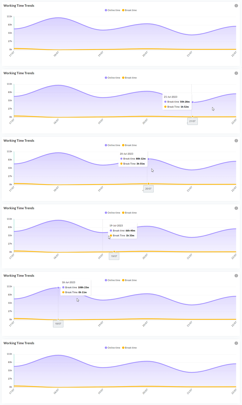
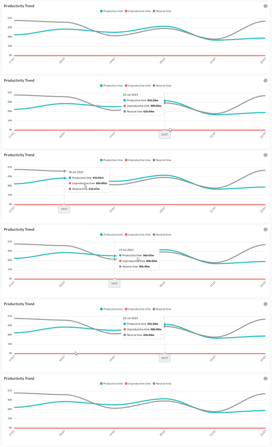
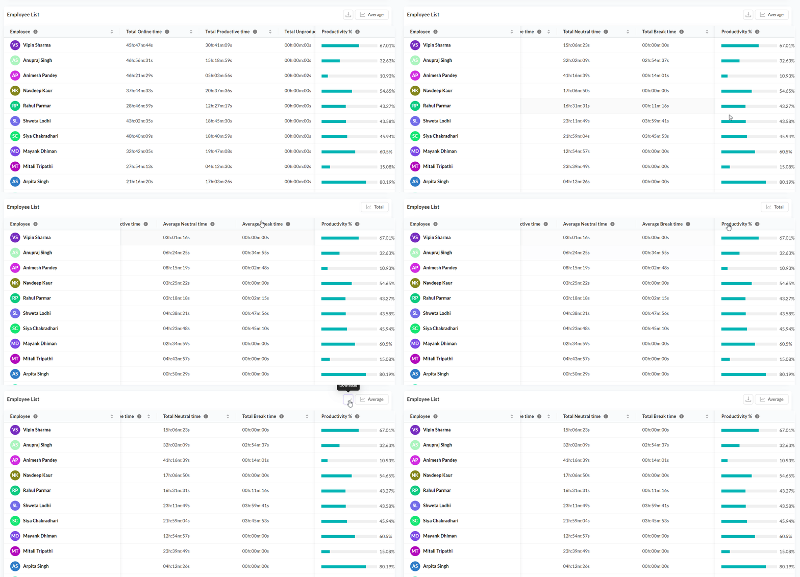
  • Detailed View: The detailed view offers team, user, and date range filters. It displays a Working Time Trends graph breaking down working time into online time and break time, plus an Overall Productivity Breakdown graph charting Productive, Unproductive, and Neutral time over the selected period. A detailed employee table lists each employee's working time, online time, productive time, unproductive time, neutral time, break time, and calculated productivity percentage. You can toggle between total values and average values for the selected period. This view is available for download as CSV.

Productivity Working Time Trends
Working Time Trends in the productivity detailed view.
Productivity trend over time
Productivity trend charting Productive, Unproductive, and Neutral time over the period.
Productivity detailed table
Detailed employee table with productivity metrics and total/average toggle.
  • The visual charts help managers understand if the ratio of productive to unproductive time is within acceptable limits for a given role.

Productivity summary
Productivity summary breaking down Productive, Unproductive, and Neutral time.

Goals

Goals allow managers to define and track specific, measurable targets.

Goal Tracking
  • Target Definitions: Goals are set organization-wide for Active Time and Productive Time targets per day (e.g., "All employees must achieve 6 hours of purely Productive time per 8-hour shift"). Admins configure goals via Settings > Productivity > Goals tab.

  • Single or Combined Goals: You can set either an Active Time goal or a Productive Time goal individually, or set both. When both goals are configured, an employee's goal is considered achieved only when both the active time and productive time targets are met. If either target is missed, the overall goal is marked as missed.

  • Maximum Goal Cap: The maximum hours allowed for a goal depends on the Full Day duration configured in your workplace settings (Settings > Workplace > Advanced Settings). For example, if a full day is set to 9 hours, the maximum goal cap is 9 hours.

  • Progress Visibility: Progress towards these goals is tracked dynamically throughout the day across the dashboard. It is recommended to wait at least one day after setting goals to see analytics reflecting progress.

  • Achievement Status: Shows the count of employees who have achieved vs missed their goals within the selected timeframe.

  • Goal Distribution: Breaks down goal achievement into four brackets: 0-25%, 25-50%, 50-75%, and >75%, giving managers a quick view of how goals are distributed across the workforce.

  • Teamwise Goal Comparison: Compare goal achievement across teams in one view. You can also compare performance against the previous period to identify teams showing improvement and those needing support.

  • Employee List Table: A detailed table showing individual goal progress for each employee, with columns for present days, goals achieved (number of days), online time, active time, activity vs goal percentage, productive time, and productivity vs goal percentage.

Goals tracking
Goals view showing target achievement and missed goals across teams.

Last updated

Was this helpful?