# Dashboard

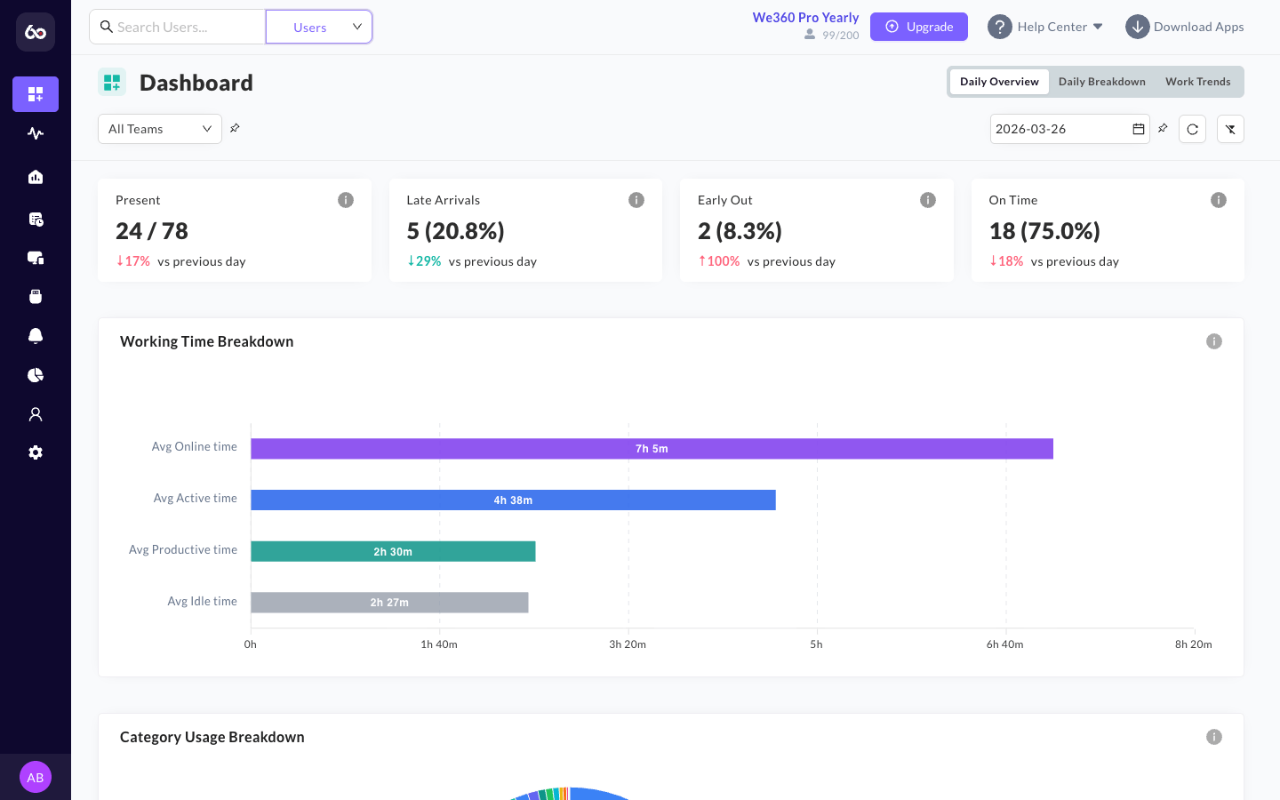
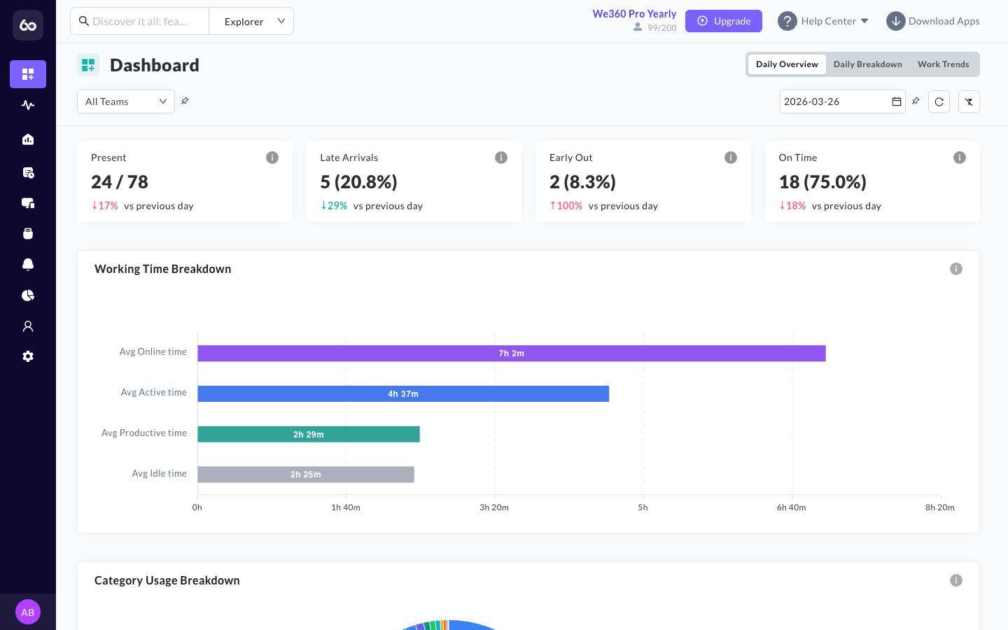
The **Dashboard** is the first screen you see when logging into the We360.ai portal. Designed specifically to provide an immediate summary of your workforce, the Dashboard synthesizes real-time metrics into actionable insights by pulling data from across the Productivity, HR, and Project suites.

As a manager, the dashboard allows you to answer the critical daily questions: *Who is working today? Are we tracking towards our goals? Who needs assistance?*

<figure><img src="/files/M5OcbcFwBkMz28BDn9yA" alt="We360.ai Dashboard default view"><figcaption><p>The Dashboard provides an at-a-glance summary of workforce performance.</p></figcaption></figure>

## Global Filters & Reporting

Before analyzing the individual widgets, it's important to understand the global filters applied to the dashboard.

* **Date Range Selector**: The entire dashboard (with the exception of the "Today's Attendance" widget) dynamically recalibrates based on the selected date range. The default date range is **Last 7 Days**. You can view yesterday's performance, last week's trends, or a custom monthly view. Note that the data retention period available depends on your license agreement.
* **Organizational Hierarchy Filters**: You can filter the dashboard to display data for the entire organization, drill down into specific departments/teams (e.g., only viewing the "Sales" team), or even isolate a specific user's performance roll-up. The Teams filter supports **hierarchical team selection** with convenient Select All and Clear options.
* **Pin Filter**: The Pin Filter feature lets you save your current filter selections across page navigation, so you don't have to re-apply filters each time you switch between sections.

<figure><img src="/files/7iuTcbpSfppvGy7uOwlJ" alt="Dashboard filtered by team"><figcaption><p>Dashboard filtered to display a specific team's performance data.</p></figcaption></figure>

* **Exporting**: The Dashboard view can be exported directly to a consolidated PDF report for executive circulation.

***

## Core Dashboard Widgets

The dashboard consists of **7 main widgets** that aggregate your workforce data into visual charts and lists.

### 1. Today's Attendance

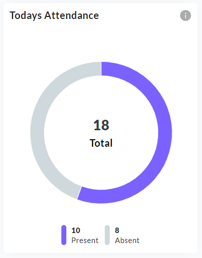
This widget provides an immediate snapshot of the current day's workforce availability.

* **Donut Chart Visualization**: It displays a donut chart with the raw count of employees who are currently marked as "Present" versus those marked "Absent", along with a breakdown of **on-time vs late arrivals**.
* **Static Context**: Note that this specific widget permanently displays *today's* real-time data and is **not** affected by the global date range filter.
* Clicking this widget redirects you immediately to the detailed Attendance logs.

<figure><img src="/files/BKOYNtsSbjMnxscmUqjC" alt="Today&#x27;s Attendance donut chart"><figcaption><p>Today's Attendance widget showing present vs absent employee count.</p></figcaption></figure>

### 2. Attendance Trends

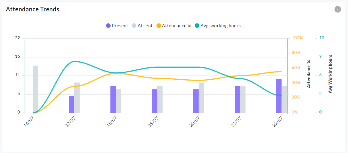
While the previous widget shows today's snapshot, the Attendance Trends widget provides a historical view of presence versus absence over your selected date range (e.g., identifying a trend of high absenteeism on Fridays).

* **Multi-graph Visualization**: This widget combines a **grouped bar graph** (present vs absent employee counts on the primary Y axis) with **line graph overlays** for attendance percentage (0--100% on a secondary Y axis) and average working time (in hours on a third Y axis). This layered view lets you correlate headcount trends with time-based metrics in a single chart.

<figure><img src="/files/ItYkJFHPyWpGq5F4EroV" alt="Attendance Trend chart"><figcaption><p>Attendance Trends widget showing present/absent counts over time.</p></figcaption></figure>

### 3. Goals Achievement Outliers

If your organization utilizes the Goals feature (setting targets like "6 hours of productive time daily"), this widget highlights the adherence to those targets.

* It visually separates employees or teams into **top achievers** and those who have **missed goals** within the filtered date range.

### 4. Leaderboards: Activity & Productivity

These modular lists act as the primary operational indicators for managers to identify high performers or instances of workflow blockage.

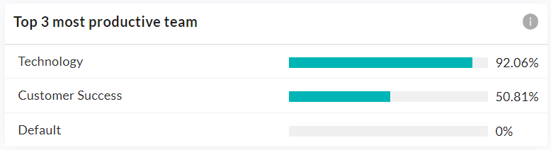
* **Productivity Outliers (Most/Least Productive Teams)**: Ranks teams based on their highest aggregate percentage of "Productive Time" (time spent on approved applications and URLs) with **progress bars** for visual comparison. Up to three teams are displayed in decreasing order of productivity. If only one team is selected in the Teams filter, only that team is shown. It distinctly highlights the bottom performers to allow managers to intervene and remove operational blockers.

<figure><img src="/files/zTD2KmaQ8zyFFO3NQ7Ry" alt="Top 3 Productive Teams"><figcaption><p>Productivity leaderboard highlighting the top 3 most productive teams.</p></figcaption></figure>

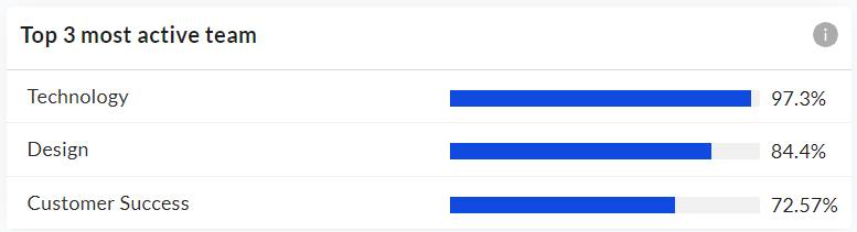
* **Activity Outliers (Most/Least Active Teams)**: Ranks teams based strictly on their physical input volume (Keystrokes/Mouse clicks per minute), serving as a raw indicator of digital engagement separate from *what* they are doing. Up to three teams are shown, arranged in decreasing order of activity percentage. Also displayed with progress bars.

<figure><img src="/files/FuFTfMCfNgSLGPhCGxQV" alt="Top 3 Active Teams"><figcaption><p>Activity leaderboard highlighting the top 3 most active teams.</p></figcaption></figure>

### 5. Trend Analysis Graphs (Activity & Productivity)

These large, overarching line graphs visualize the continuous ebb and flow of your workforce.

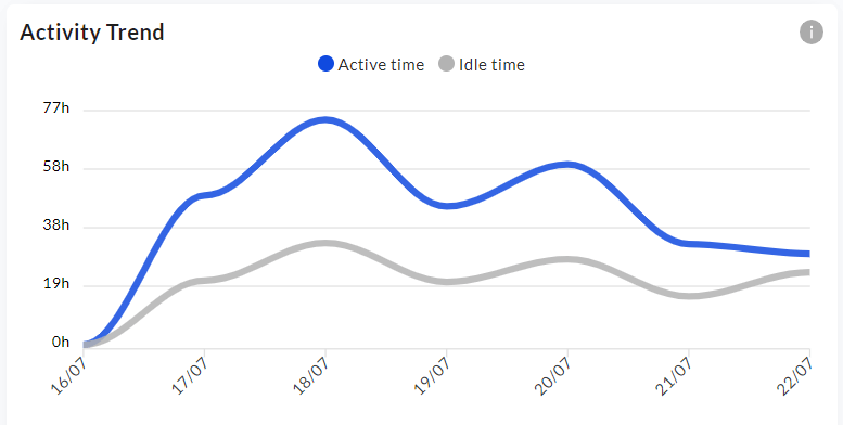
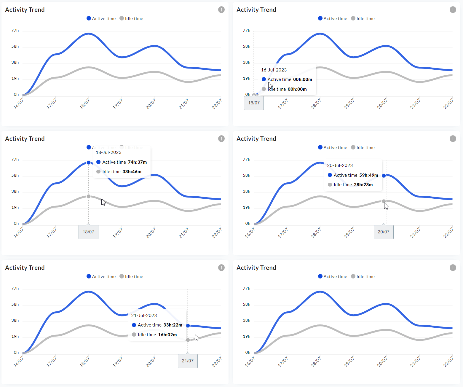
* **Activity Trend**: A **line chart** displaying the fluctuating trend of **active vs idle time** (in hours) over the filtered date range, with dates on the X axis. Hovering on the graph displays the active and idle time breakdown for each individual day. This helps you identify the most engaging hours or days of the week.

<figure><img src="/files/hrywkjEbxM4zdHz1wOd8" alt="Activity Trend line chart"><figcaption><p>Activity Trend showing active vs idle time over the selected period.</p></figcaption></figure>

<figure><img src="/files/3AXqG10xxHDrDoWefqsK" alt="Activity Trend hover interaction"><figcaption><p>Hovering on the Activity Trend reveals the daily active/idle time breakdown.</p></figcaption></figure>

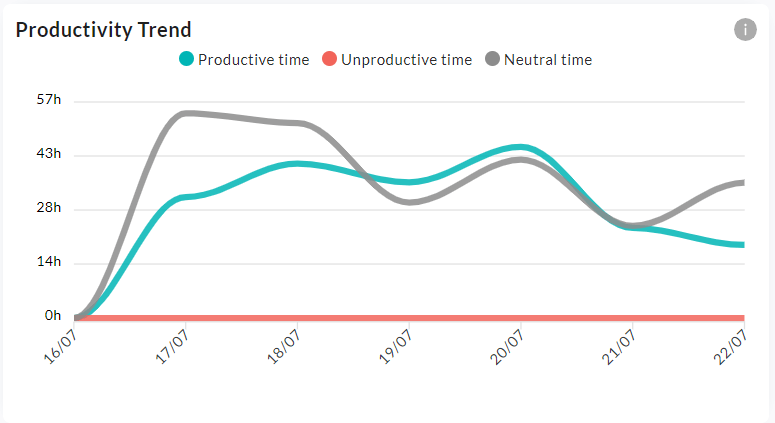
* **Productivity Trend**: A **line chart** providing a visual breakdown of time categorization over the selected date range, with dates on the X axis and time (in hours) on the Y axis. It charts the distinct trend lines for **Productive**, **Unproductive**, and **Neutral** time. Hovering on the graph displays the productive, unproductive, and neutral time detail for each day. This allows you to easily spot anomalies (e.g., a massive spike in "Unproductive" time on a specific date).

<figure><img src="/files/10ep1oEA6Hz1QuMaH39v" alt="Productivity Trend line chart"><figcaption><p>Productivity Trend charting Productive, Unproductive, and Neutral time.</p></figcaption></figure>


---

# Agent Instructions: Querying This Documentation

If you need additional information that is not directly available in this page, you can query the documentation dynamically by asking a question.

Perform an HTTP GET request on the current page URL with the `ask` query parameter:

```
GET https://docs.we360.ai/reference/work-and-time-management/user-interfaces/portal/productivity-suite/dashboard.md?ask=<question>
```

The question should be specific, self-contained, and written in natural language.
The response will contain a direct answer to the question and relevant excerpts and sources from the documentation.

Use this mechanism when the answer is not explicitly present in the current page, you need clarification or additional context, or you want to retrieve related documentation sections.