> For the complete documentation index, see [llms.txt](https://docs.we360.ai/llms.txt). Markdown versions of documentation pages are available by appending `.md` to page URLs; this page is available as [Markdown](https://docs.we360.ai/reference/work-and-time-management/user-interfaces/portal/universal-tools/user-detail.md).
# User Details
We360.ai user detail — individual employee productivity analytics, activity timeline, and monitoring insights.
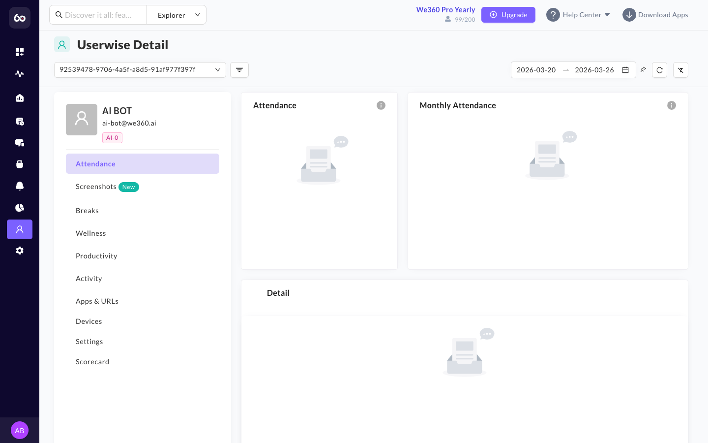
While the overarching dashboards provide a macro view of the organization, the **User Details** page is the ultimate micro view. Clicking on an employee's name anywhere within the portal will direct a manager to this comprehensive dossier.
User detail page with comprehensive individual analytics
{% hint style="info" %}
The User Detail page essentially recreates the entire suite of analytical tools, but filters the data exclusively for the selected individual.
{% endhint %}
## Key Analytics Available
{% columns %}
{% column %}
**⏱ Granular Timeline**
Review the specific start, stop, and idle periods of the user's day in chronological order. Easily spot breaks and off-system time.
{% endcolumn %}
{% column %}
**💻 App & URL Usage**
See exactly what software and websites they focused on and for how long. Helps identify the most utilized platforms and productivity alignment.
{% endcolumn %}
{% endcolumns %}
{% columns %}
{% column %}
**📸 Visual Evidence**
*(If enabled by policy)* View the localized timeline of specific screen captures or camera snapshots taken during their session. Supports blurring for privacy.
{% endcolumn %}
{% column %}
**📅 Timesheets & Leaves**
Review their personal project allocations and time-off balances in one unified location, syncing with HRMS integrations if configured.
{% endcolumn %}
{% endcolumns %}
## Available Sub-Tabs
The User Detail page organizes individual analytics across **9 dedicated sub-tabs**:
| Tab | What it shows |
| ---------------- | ---------------------------------------------------------------------------------------------------------------------------------------------------------------------------------------------------------------------------------------- |
| **Attendance** | Attendance doughnut chart (present/absent for the date range), monthly attendance calendar visualizing the employee's attendance for the month, and an attendance detail list showing datewise in/out times, working duration, and logs. |
| **Breaks** | Duration and frequency of breaks taken during each workday. |
| **Wellness** | Wellness doughnut chart, monthly wellness calendar, and a wellness detail list. |
| **Productivity** | Metric cards for Top Application, Top URL, and Top Category. Productivity breakdown doughnut chart and a productivity detail table. |
| **Activity** | Metric cards for Top Application, Top URL, and Top Category. Activity breakdown doughnut chart and an activity detail table. |
| **Apps & URLs** | Metric cards for Top Application, Top URL, and Top Category. Category utilization chart, total application usage, total URL usage, and a list of all applications used. |
| **Devices** | OS version, hardware identifiers, and IP address of the user's active endpoints. |
| **Settings** | User-specific tracking and policy overrides configured by an admin. |
| **Scorecard** | Monthly performance scorecard with comparative pentagon graph (see below). |
## Employee Scorecard
The **Scorecard** tab provides a single-page summary of an employee's monthly performance. It is available to admins, managers, and the employee themselves, and can be downloaded as a report.
Comparative Analysis (Pentagon Graph)
The scorecard plots five key performance indicators on a pentagon-shaped radar chart, comparing three overlays:
* **User** -- the individual employee's scores.
* **Team** -- the average scores of the employee's team.
* **Company** -- the organization-wide average.
This lets managers instantly see where an employee excels or falls behind relative to their peers.
Monthly Performance Insights
Below the pentagon graph, the scorecard breaks performance into six categories:
* **Attendance** -- Total present days, half days, late arrivals, early departures, average working time, and total break time.
* **Productivity** -- Total and average productive, neutral, and unproductive time; most and least productive days.
* **Activity** -- Total and average online, active, and idle time to gauge engagement.
* **Apps & URLs** -- Top applications and websites used, categorized by productivity classification.
* **Goals** -- Monthly goal achievement rate, comparing days goals were met versus missed.
* **Wellness** -- Workload balance indicators showing overburdened or underutilized days.
Supplemental Information
The user detail view also surfaces:
* **Manual Time Logs:** View and approve manual hours submitted by the user.
* **Device Information:** View the OS version, unique hardware identifiers, and IP address of the user's active endpoint.
---
# Agent Instructions
This documentation is published with GitBook. GitBook is the documentation platform designed so that both humans and AI agents can read, navigate, and reason over technical content effectively. Learn more at gitbook.com.
## Querying This Documentation
If you need additional information that is not directly available in this page, you can query the documentation dynamically by asking a question.
Perform an HTTP GET request on the current page URL with the `ask` query parameter, and the optional `goal` query parameter:
```
GET https://docs.we360.ai/reference/work-and-time-management/user-interfaces/portal/universal-tools/user-detail.md?ask=&goal=
```
`ask` is the immediate question: it should be specific, self-contained, and written in natural language.
`goal` is optional and describes the broader end goal you are ultimately trying to accomplish on behalf of the user. GitBook uses it to tailor the answer towards what is most useful for that goal.
The response will contain a direct answer to the question and relevant excerpts and sources from the documentation.
Use this mechanism when the answer is not explicitly present in the current page, you need clarification or additional context, or you want to retrieve related documentation sections.